• Products
    • Sage Intelligence Reporting
      • Enrolment
    • Velixo
      • Enrolment
        • Velixo for Acumatica
        • Velixo for Sage Intacct
  • Services
    • Consulting
    • Training
    • Development
  • Support
    • Support Overview
    • Create Support Ticket
    • Book A Session
    • Knowledgebase
  • About
    • About Us
  • Contact
  • Products
    • Sage Intelligence Reporting
      • Enrolment
    • Velixo
      • Enrolment
        • Velixo for Acumatica
        • Velixo for Sage Intacct
  • Services
    • Consulting
    • Training
    • Development
  • Support
    • Support Overview
    • Create Support Ticket
    • Book A Session
    • Knowledgebase
  • About
    • About Us
  • Contact
Quick Support
Book Demo

How to automatically highlight specific data using a bar chart in Excel

By admin on April 15, 2019April 19, 2019

This Microsoft® Excel® tip will come in handy when you want to create a chart that will populate your data and highlight only certain subsets of that data.

Download the workbook to practise this exercise.

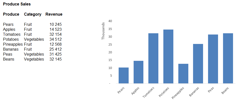
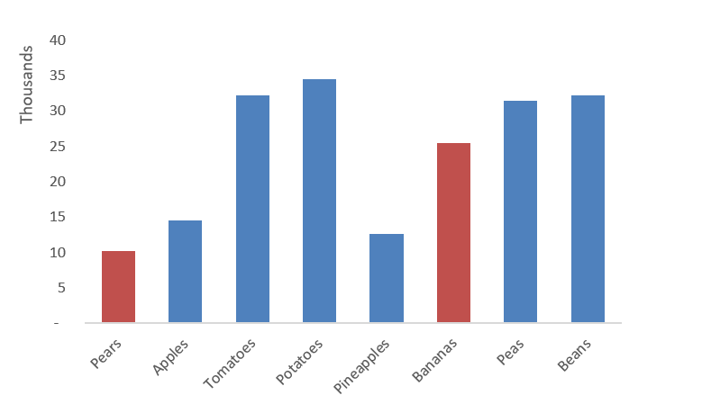
In the example below, we will look at a grocery store. The chart displays the revenue generated from the produce department.

Bar-Chart-In-Excel-showing-specific-Data

If, for example, you wanted to see how Pears compare to Bananas you could easily highlight these data points by following the below steps:

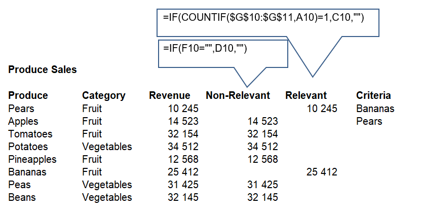
1. Add additional columns for “Relevant”, “Non-Relevant” and “Criteria”.

2. Enter the criteria to be met under the “Criteria” columns, e.g. Bananas and Pears.

3. The “Relevant” column uses an IF(COUNTIF formula to determine if the item meets the criteria and if so will return the value.

4. The “Non-Relevant” column will return a value if the criteria was not met for the “Relevant” column.

Creating-Bar-Chart-In-Excel-to-Highlight-specific-Data

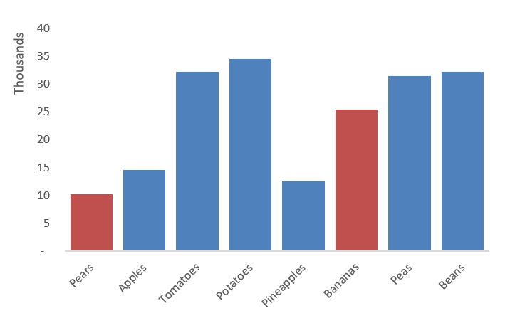
5. Create a chart using the “Relevant” and “Non-Relevant” columns.  The columns are displayed in different colours.

Bar-Chart-In-Excel-comparing-specific-Data

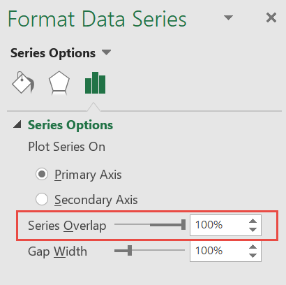
6. For the chart to display correctly, right click on a data bar and select Format Data Series.

7. From the Format Data Series dialogue box, set the Series Overlap to 100%. As each produce type has two columns being used in the chart, one with a value and one equal to 0, by overlapping the bars we avoid having an “empty bar” being displayed.

Format-Data-series-overlap

By changing your criteria, the chart is automatically refreshed, and the relevant bars are highlighted.

Bar-Chart-In-Excel-Highlighting-specific-Data

The post How to automatically highlight specific data using a bar chart in Excel appeared first on Sage Intelligence.

Source: Excel on Steroids

Post navigation

How to create and view your Management Packs in Sage 50cloud Intelligence
How to use the new “Up to Period” filter in Sage Intelligence for Accounting

Leave a Reply Cancel reply

Your email address will not be published. Required fields are marked *

Recent Posts

  • Why Working In Excel Works
  • Alchemex Welcomes Velixo 6 For MYOB Advanced
  • Welcome to Velixo Reports Version 4.2
  • Part 3 of 3: Learn how to create a Management Pack in Sage 50cloud Intelligence
  • Part 3 of 3: Create and customize reports easily with the Financial Report Designer

Search

Contact Us

Phone: +61 2 9890 2339
Email: sales@alchemex.com.au
Address: PO Box 212, Deaken West, Canberra, Australia, 2600

Products

  • Intelligence Reporting
  • Velixo Reports

Services

  • Consulting
  • Training
  • Development

About

  • About Us
  • Partners
  • Blog

Support

  • New Ticket
  • Community (Coming Soon)
  • Knowledgebase

Phone: +61 2 9890 2339
Sales: sales@alchemex.com.au
Support: support@alchemex.com.au

Facebook-f Linkedin

© All rights reserved Alchemex Pty Ltd 2020

Made with ❤ by Unfazed Ltd